
A colour storyOne Colour, Three Ways to Read It
Undertone, finish and contrast: the three things a photo cannot tell you. Here is how to read them.
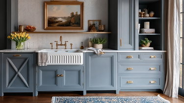
The Undertone
Every neutral leans somewhere. The same grey looks green next to oak and blue next to white trim.
The Finish
Matte absorbs light and forgives an imperfect wall. Gloss gives it back and shows every ripple.
- Matte
- Satin
- Gloss
The colour is the same in all three. The sheen shown here is an illustration of how each finish catches light — order a sample to judge it properly.
The Contrast
If you are painting behind lettering or a sign, the figure below is the one that counts.
Text legibility
How legible text is when set directly on this colour. Measured with the WCAG 2.1 relative-luminance formula.
Large text on this colour Sample text on this colour
White text Contrast ratio 5.70:1
- AA · large text · 3:1 Passes
- AA · body text · 4.5:1 Passes
- AAA · body text · 7:1 Fails
Large text on this colour Sample text on this colour
Black text Contrast ratio 3.70:1
- AA · large text · 3:1 Passes
- AA · body text · 4.5:1 Fails
- AAA · body text · 7:1 Fails
Most legible on this colour: white text, at 5.70:1.
“Large text” means 24px, or 19px and bold. The thresholds are WCAG 2.1, which is what accessibility conformance is measured against today.
The Same Pigment, Three Readings
The jar holds the same pigment in all three cases. What changes is how much light the surface gives back — and so the colour you see.
Matte
0 = dead flat, 100 = full gloss
Absorbs light. The shade looks deeper, more muted, and a slightly hollowed surface stops showing.
Best for Antique furniture, imperfect walls, low-traffic rooms
Not for Cabinet doors, tabletops, anything washed every week
Satin
0 = dead flat, 100 = full gloss
The compromise. Enough sheen to be wiped clean, little enough not to draw every ripple in the wood.
Best for Kitchens, bathrooms, furniture used every day
Not for Large walls lit by raking light
Gloss
0 = dead flat, 100 = full gloss
Gives light back. The colour goes up a notch and the slightest flaw in the prep shows from across the room.
Best for Trim, doors, pieces with character
Not for Surfaces sanded in a hurry
The scale places the finishes relative to one another. It is not a measurement taken from a jar.
A colour is never just one colour. It is the light in the room, the wall next to it, and the finish you chose.

How it’s madeMixed in Small Batches
Every shade is mixed in small quantities, tried on real wood, then reworked until it covers in two coats.
Order the Three You Cannot Decide Between
Painted samples, in the real finish. Live with them for a week before buying a jar.